Approach
Working alongside the Verge Scientific team, we first dug into the company’s background, audience, and goals for the branding via Verge’s brand strategy workshop and “brandscape” analysis. This comprehensive overview gave us a solid foundation with which to explore the brand visuals and determine what messaging to emphasize.
Major themes that emerged from our research was the amplification of networks and ripples of impact to restore cellular function and maintain efficiency in the body.
These gave us ideas for impactful visuals.
Patterns: We developed a series of patterns to visually represent amplification and ripples to help unify and illuminate the key messaging.
Color: We maintained the cool blues from the original logo and added bold, bright, warm colors of orange, yellow, and magenta to reflect progress and forward-thinking.
Quotes: We recommended including the voices of their world-class and established scientists, highlighting quotes from the top three scientific thought leaders on the team to leverage their expertise in the field and reinforce the clinical opportunity.


Website
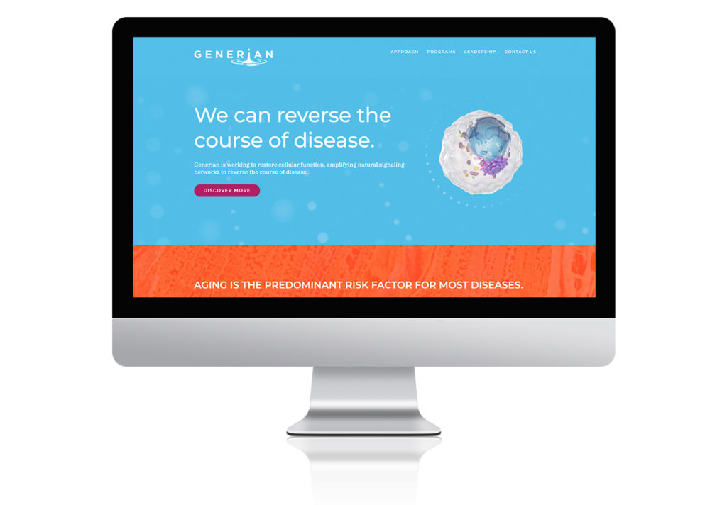
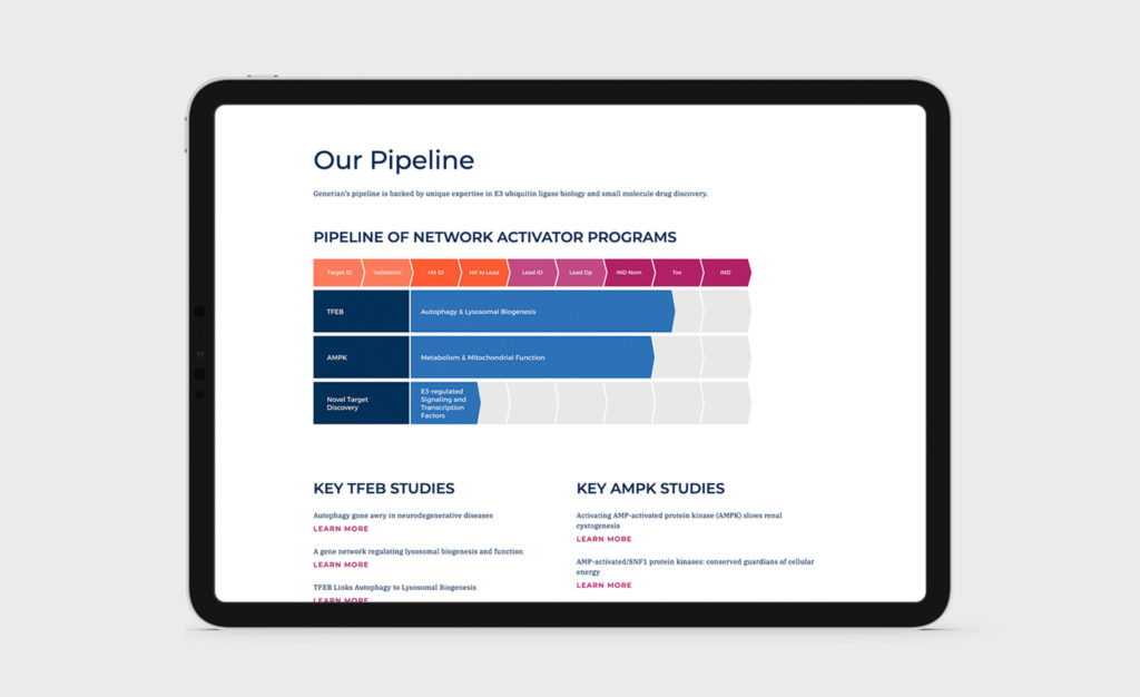
Generian’s science reflects an entirely different mindset to tackling a range of diseases, by developing medicines that increase specific target protein activity and improve cellular function. Given this unique approach, it made sense to lead with one concise, attention-grabbing statement on the home page: “We can reverse the course of disease.” From this bold introduction, users are invited to discover the science behind this statement through easy-to-digest diagrams and a breakdown of their TFEB and AMPK programs. We continued our established palette, as we moved to other graphic elements and sections of the site, including links to their key studies and the landing page for their leadership team.
Since the company is in early clinical stages, the focus of the website was on the science and the enormous potential for these therapies, celebrating the process, the experts and the goal on the horizon.
To allow content to expand and the website to remain fresh, we built the site with a custom WordPress theme, enabling the client to make updates via an administrative backend which was a cost-effective and efficient approach. We designed and developed it to be responsive so the user experience was optimized, whether viewed on a desktop, tablet, or mobile device.


Impact
By crystalizing the company’s message from the beginning, we were able to present Generian’s complex mission in a highly visual and approachable way which they have found to be extremely helpful as they communicate their story to investors, colleagues, and others in their sphere. They have been pleased at how their long-term goal of reversing disease is always front and center to keep their audience focused on the fulfillment of their game-changing work down the road.

