In our visually dominated world, it’s more important than ever—and more challenging than ever—to find fast, impactful ways to get your message across. If your message is one that relates to or is supported by data, converting that data into a graphic form is essential to ensure that you engage your audience quickly and effectively. This process is called data visualization, and with today’s technology, there are endless opportunities to create clear and compelling visual stories.
The field of data visualization has been a communications tool for longer than most of us would guess. I’ll never forget the first time I realized just how powerful this design approach could be when attending a talk in New York City by Edward Tufte, noted for his writings on information design. This pioneer in the field of data visualization presented a statistical graphic—designed in 1869!—that’s still one of my favorites.
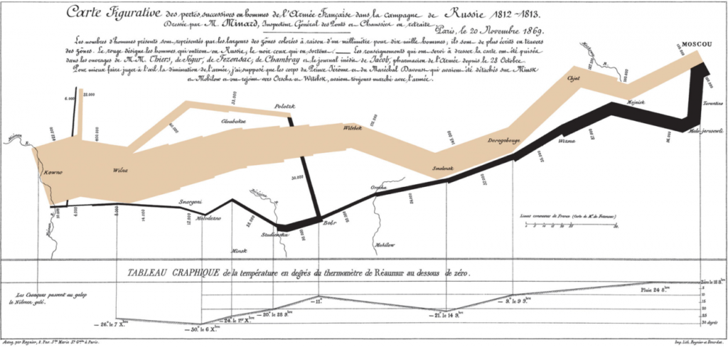
Tufte presented the Carte Figurative (shown below) by Charles Joseph Minard that illustrates facts relating to the French Invasion of Russia in 1812. This graphic features a band that shows the size of Napoleon’s army at specific geographic points during their advance and retreat. We can see in an instant the stark contrast between the number of troops at the outset of the invasion and the decimated number of troops at the end as they approached Moscow.

This is an early example of someone not just presenting raw data but also interpreting it and spinning it into a clear visual story. As a visual learner—and these days we’re all pretty much visual learners—this graphic taught me more at a glance than I could have absorbed from any spread sheet or history book.
Data Visualizations vs. Infographics
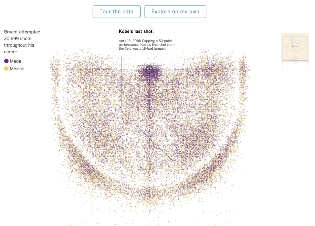
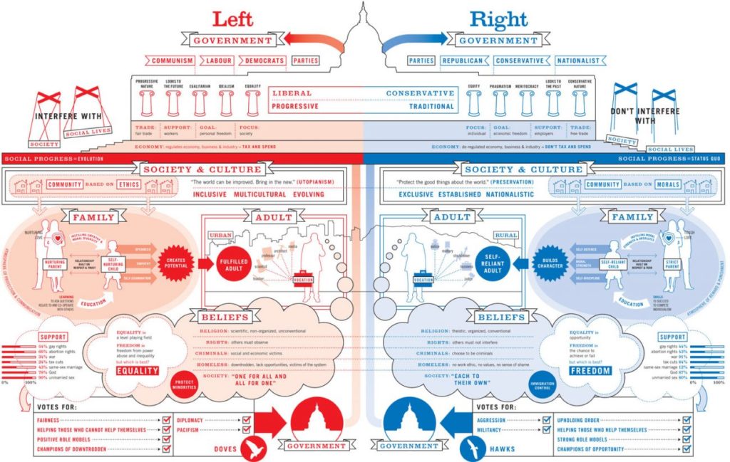
The technique of data visualization as a storytelling tool has evolved into the ubiquitous infographic—a graphic, often containing data, that tells a predetermined visual story. While there is a great deal of overlap between data visualizations and infographics, there are nuanced differences: a data visualization provides an objective representation of the data and expects the user to draw his/her own conclusion, whereas an infographic—using visual storytelling and targeting a specific audience—is more subjective, with a goal of leading that audience to a conclusion that supports a particular message. Here are examples of each.
Data Visualization: Raw data translated into a quickly grasped visual form

Infographic: Presenting data or ideas in a way that influences thought and leads to a particular conclusion

If you are unsure whether a particular graphic you are reviewing is a data visualization or an infographic, ask yourself two questions:
- Is the information I have data-driven (data visualization) or idea-driven (infographic)?
- Is the graphic simply exploring something (data visualization) or expressing/comparing/ supporting something (infographic)?
Interactive Infographics, A Powerful Blending of Data and Ideas
Even more impactful and effective in storytelling is the interactive infographic, a device that both presents the data and interprets the data in a way that’s exceptionally meaningful for the user. Through the use of today’s advanced front-end development capabilities, you can design an infographic that tells a visual story backed up with data visualizations that a user can interact with directly. Add animation, and this combination allows you to take your audience on a step-by-step journey as you roll out your message, and support your conclusions with data for greater impact and credibility. Take a look at this compelling example designed by my team at Owl’s Head Solutions.

The benefits of such a device are clear:
- Animation based on scroll position allows you to lead the viewer through a visual story at the pace and in the order you intend.
- The user can review and interact with the data to support your conclusions and underscore your credibility.
- Your design can allow users to access the information in different ways. In our example—in the section “How Prevalent Is Lyme Disease In Maine?”—they can sort the data by county or by year, then by sex or age group, i.e. targeting data that’s most meaningful to them.
- Because you are asking users to interact with the experience, they become more engaged and are therefore more likely to absorb and recall your message. And when users feel as if they are being educated rather than pitched to, you build a relationship based on trust and knowledge between your audience and your brand.
- You can track the audience interactions to gain more targeted knowledge about the data they are interested in.
- If the data is available via live API, it will automatically update as new data becomes available.
- You can see how interactive infographics encompass and blend elements of both data visualization and conventional infographics. They offer tremendous opportunities for engaging with a digital audience. More and more brands will be embracing this technology and it’s easy to see why.
At Owl’s Head Solutions, we have found interactive infographics to be extremely effective and efficient. In our visual, non-reading world where virtually everyone is on information overload, it is essential to find ways to cut through the clutter. Presenting information visually, in ways that involve and connect with your audience, is one of the most powerful communications tools in the designer’s toolbox.

