Approach
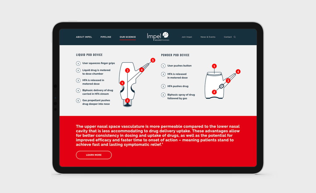
In meeting with the client to better understand their technology, their pipeline, their goals, and their passion for their work, one theme above all bubbled to the top: Impel is going to disrupt the healthcare industry with their novel approach to administering medicine. We needed to clearly present and distinguish the parts of their system: the science behind the POD delivery method, the proven, large-molecule drugs they are working with, and the precision of the delivery devices themselves.
Using their logo as a jumping off point, we created core graphics featuring precise lines and nodes all working together to represent broad scientific and neuroscience concepts. We expanded their visual system with an adjusted color palette that we kept minimal and precise, using varying hues of blue paired with a standout red that allowed us to emphasize the most important messaging. We felt that photography should be monochromatic, mostly in black and white with some use of blue tones, to create a bold impact that is serious and science-centric.
The graphics, iconography, and photography became a visual library that the client could pull from as needed, providing maximum flexibility and a cohesive look among different brand components.

Website Relaunch
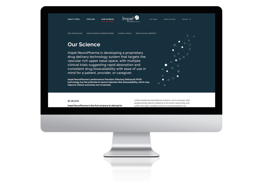
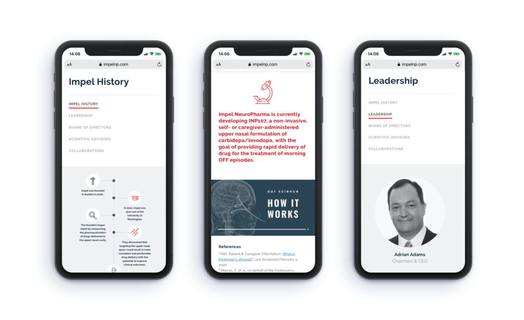
The website was totally redesigned with clear, concise information presented in easy-to-digest bites that direct users to the product pipeline. The main messaging and lines-and-nodes graphics on the homepage animate in an upward motion, a metaphor for the company’s trajectory, precision, and focus as well as a representation of the path of the drug delivery within the POD device itself.
To allow content to expand and the website to remain fresh, we built the site with a custom WordPress theme, enabling the client to make updates via an administrative backend which was a cost-effective and efficient approach. We designed and developed it to be responsive so the user experience was optimized whether viewed on a desktop, tablet, or mobile device.

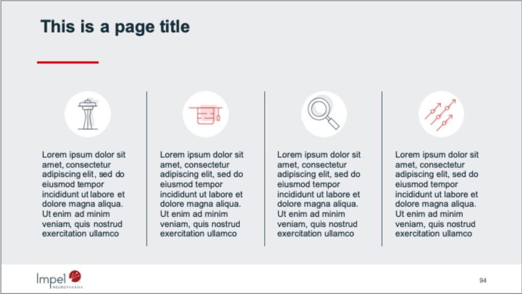
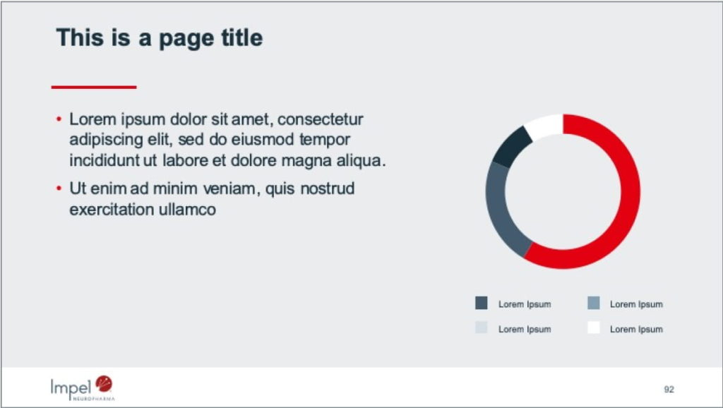
Corporate Capabilities Presentation
The presentation was built to be exceedingly flexible while featuring several design options from the visual library.


“Working with the Owl’s Head team has been a terrific experience. They designed and built a stunning and engaging website, in addition to a refresh of our corporate identity assets. The team quickly understood our ideas and requirements, helping us create a visual identity that feels fresh, bold, and easily communicates complex ideas about our technology platform. A sensible and experienced team that is able to keep up with the demands of a fast-moving biopharma organization.”
—Jen Berman, VP of Marketing
Impact
Impel has been incredibly pleased with the rebrand. They appreciate our sensitivity to the subtleties of their mission and the clarity required to communicate their technology and the science behind it, as well as our ability to present complex information in clean, easy-to-grasp visual ways. They have received positive feedback from their team and their network of key stakeholders.


