Approach
The redesign of the iTeos brand and its system came down to three fundamental questions: What are we trying to communicate, who needs to hear it, and what else do they need? We worked to identify the core paths to iTeos, and to prioritize the journeys and outcomes that the iTeos website, presentation decks, and even collateral would need to make possible.
iTeos did not want just a logo and a PowerPoint / website cleanup: They wanted a proper brand, with more considered, compelling storytelling of their work and its potential.
Their two clinical stage programs are not just listed and identified, but explained with care, contextualized, and presented with all of the promise behind their pursuit.
We can speak to Investor needs and relations with dynamic, adaptable decks, and on the website, fully integrated resource pages incorporating News & Events, Stock Information, Governance, and Investor Resources in the same style and organization of the greater site.
Recruitment capabilities are greatly strengthened with a Careers page embodying and articulating iTeos’s culture, mission, and the smiling faces of so many current team members.
Our approach—from the research of to the design of so multi-dimensional an identity—was to identify the stories in the science, and make sure we could present those stories in engaging, approachable, and accessible pieces. Informed simplicity, at its best.
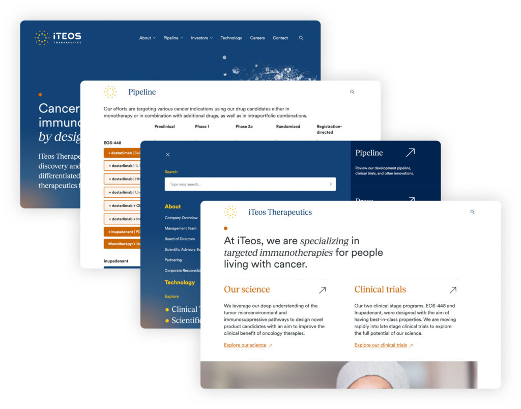
We paired a bold new identity with a deeply reimagined design system—cohesive, consistent, and scalable—that powerfully re-positions the guiding passions, sense of necessity, and considerable capabilities of iTeos Therapeutics.
Website Redesign / Relaunch
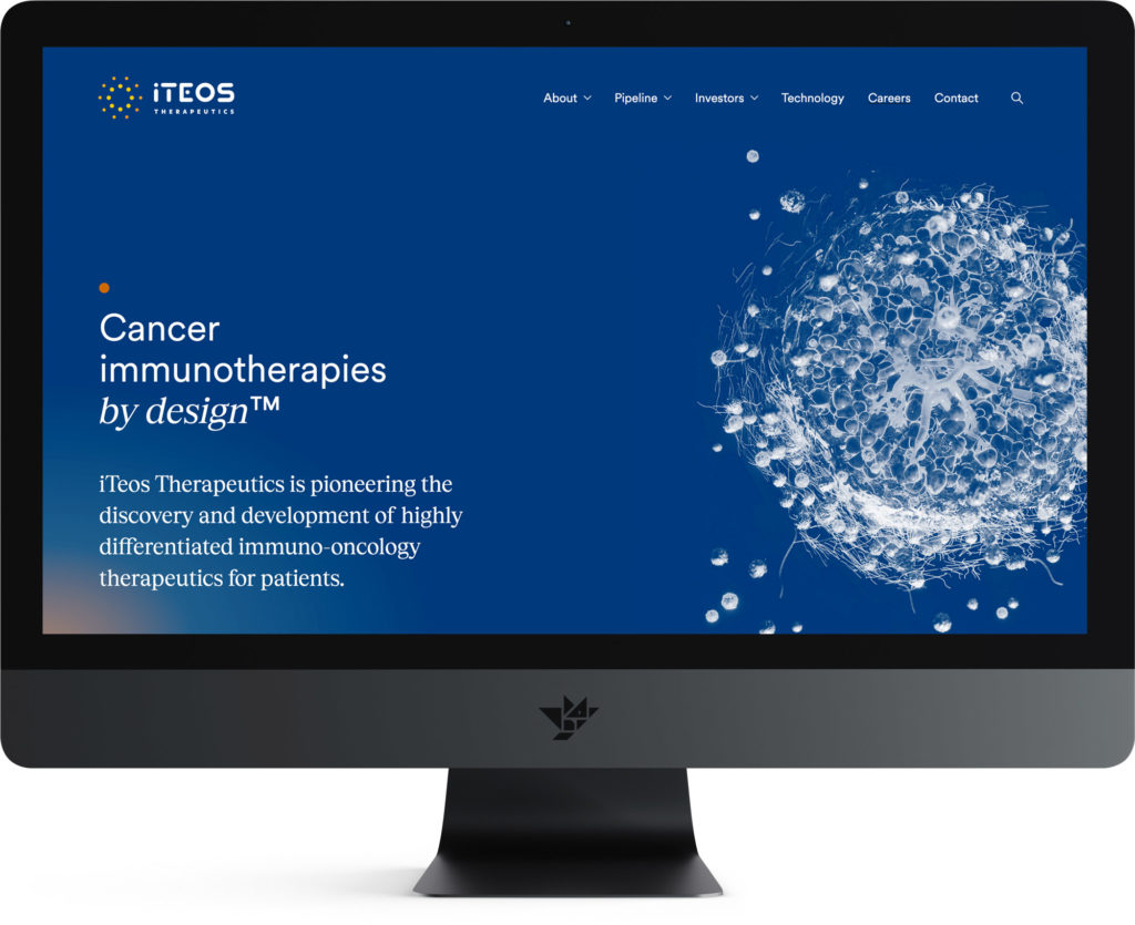
The iTeos team was excited to have a website that offered much more dynamic, targeted messaging, positioning their work, value, and progress in a more concise but discursive manner. The design goes to great lengths to make clear, accessible, and understandable the vision and complex research that underlies that work, while creating clear pathways to higher value content and resources.
While offering multiple points of entry to all key sections, the redesigned site has a much more precise hierarchy, establishing consistent paths paved with decisive, clarifying copy. That sense of organization—informed simplicity—accented with key stylistic decisions gave us a website that stands out from competitor sites as well as more traditional corporate grid structures, with a user experience that embodies iTeos’s dynamism and focus.
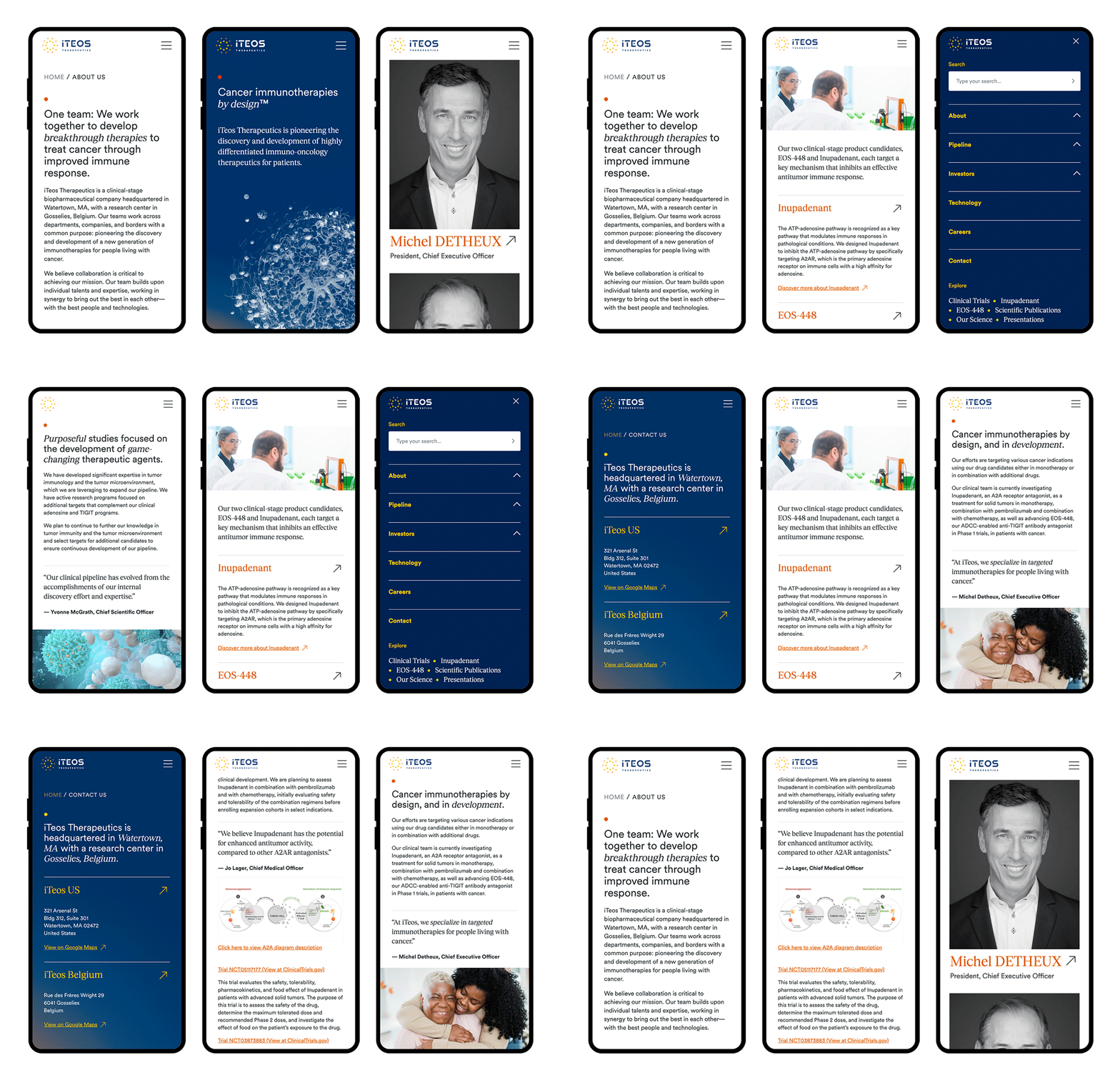
Responsive variations for the website were designed not as afterthoughts, but in the interest of consistency and an improved reading experience.
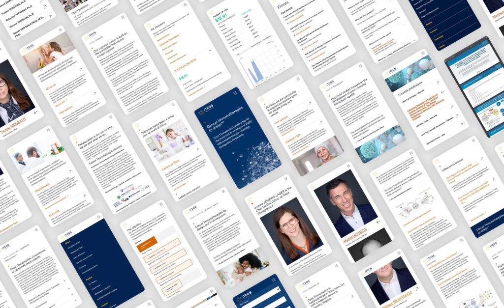
Profile pages are nested in considered and highly usable sub-navigation, resulting in few-to-zero dead-ends. Instead, intuitive options for deeper exploration abound, providing seamless movement from pipeline to clinical trial statuses to team members.
We didn’t build just a website, but a digital ecosystem that ensures their web presence can evolve for years to come.
Brand System & Guide
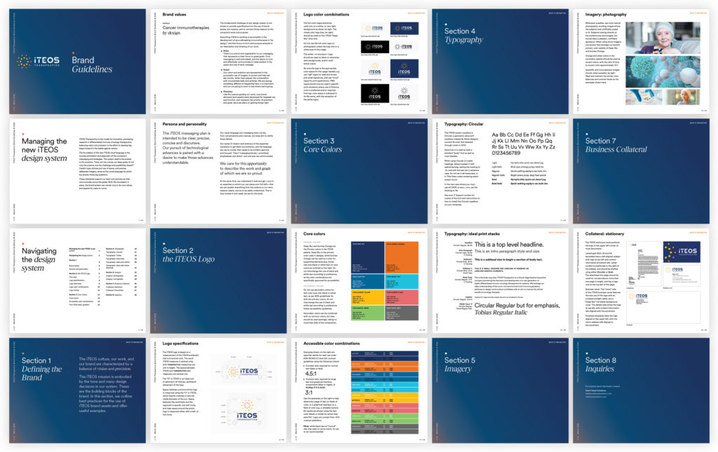
A comprehensive redesign goes from aesthetic to actionable when it can be systematized, with specifications allowing for the consistent deployment of brand assets and messaging components by a variety of managers and non- technical users.
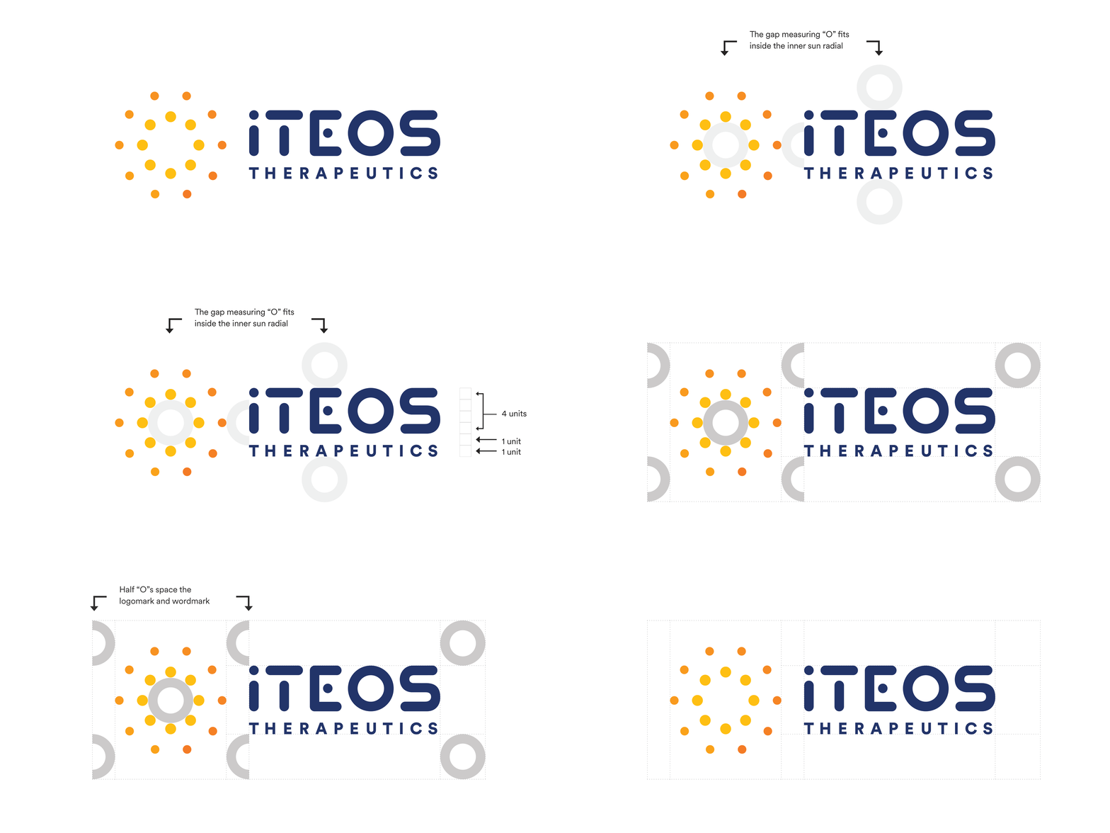
The iTeos Brand Guidelines are more than a summation of our work across platforms and media for the company. At 27 pages and counting, it is the ultimate manual of brand values, a showcase of how components need to function together to deliver, in all environments, utility and emotion. We wanted to provide their team with a toolset encompassing logo specifications, and appropriate uses; core colors and accessible combinations; typographical trees and use cases; imagery standards and direction; business collateral specifications; and much, much more.
Brand: Logo, Collateral
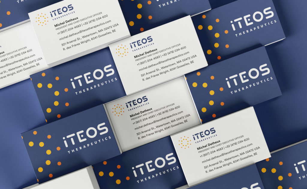
Our new identity for iTeos reflects the growth, energy, and promise of the company and its science. While the work is carefully positioned by clear, concise, and typographically stylized “hero” elements, that promise is represented in the radiant sunrise of the logomark, and even the “dawn gradient” that backgrounds business cards, corporate decks, and even the website, There are throughlines within the throughlines, as we developed a visual language with context-specific adjustments capable of telling the right stories to the right audience, at the right times.
Conclusion
A comprehensive, head-to-toe identity redesign takes more than … design. Content strategy, campaign thinking, and institutional support are critical drivers of a dynamic brand story. With a revitalized design system and messaging plan, our website, collateral, and corporate decks were able to take flight, altogether telling a much more compelling story of iTeos and its incredible work.


