Approach
At the center of Maine agriculture, and its commitment to excellence, is its hard-working farmers and producers. We knew we wanted them to be the focal-point of the brand. We presented three initial ideas that told this story visually, some dialing up our use of iconography, some utilizing portraits, but all showing real Maine farmers and producers in action.
Ultimately the client chose a direction that was bold yet flexible.
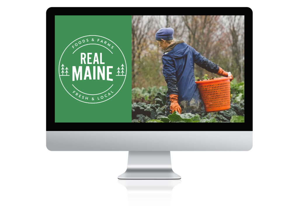
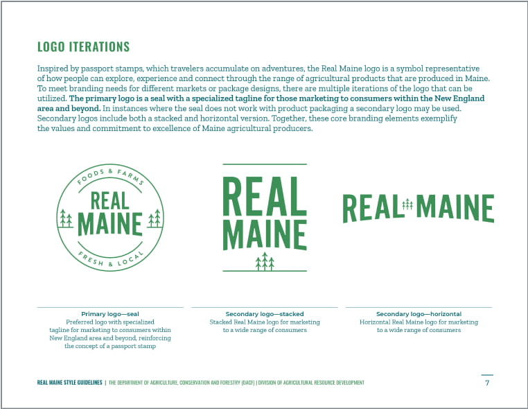
Inspired by a passport stamp, the logo acts as a visual metaphor for how Real Maine allows people to explore, experience, discover, and connect through a range of agricultural products and experiences.
Whether already in the state of Maine where you can visit a local farmer’s market, or across the country where you can purchase a bag of Maine potatoes from your grocery store, the stamp embodies the values and commitment to excellence of our Maine agricultural producers.
From a visual perspective, we incorporated the use of trees into the mark as a broad representation of the physical environment of Maine, the connection to its nickname “The Pine Tree” state, and to represent Maine agricultural products by their broad location. They are simple and understated to give “REAL MAINE” the most prominence, ensuring the final logo can easily translate on a range of materials from stickers to trade show backdrops.
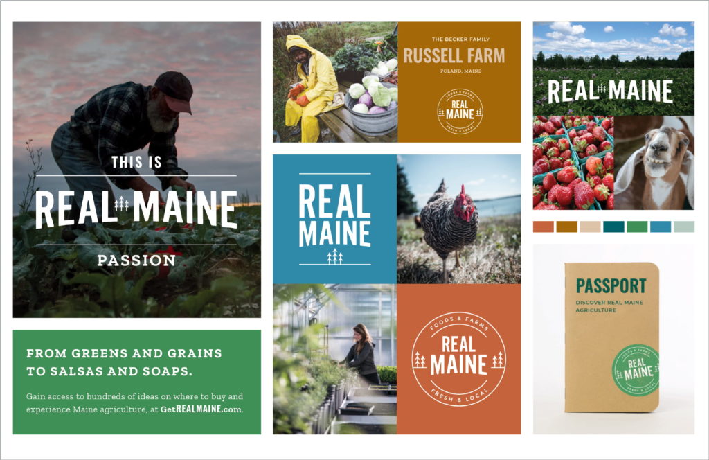
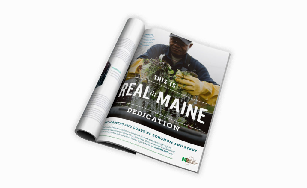
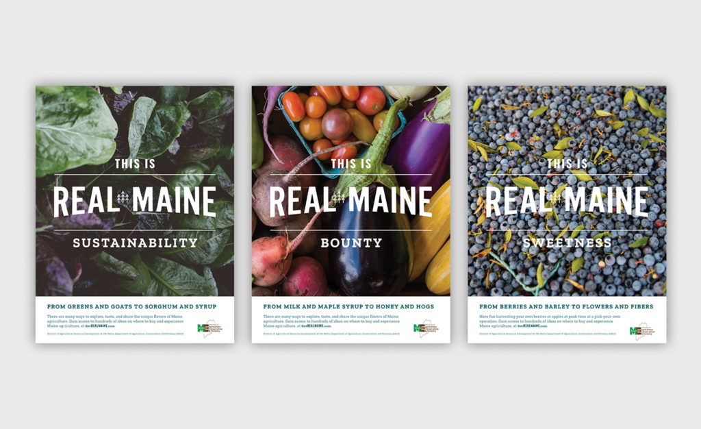
The brand materials incorporate the program name and logotype directly into the messaging to communicate core values of Maine producers and benefits of their products. By stating “this is REAL MAINE pride / community / nourishment / passion” paired with images of real Maine farmers and producers we tell the story of Maine agriculture through various lenses, at times speaking to consumers and at other times speaking to the farmers who can benefit from Get Real, Get Maine! development programs.
Brand Collateral
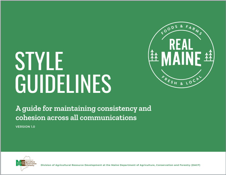
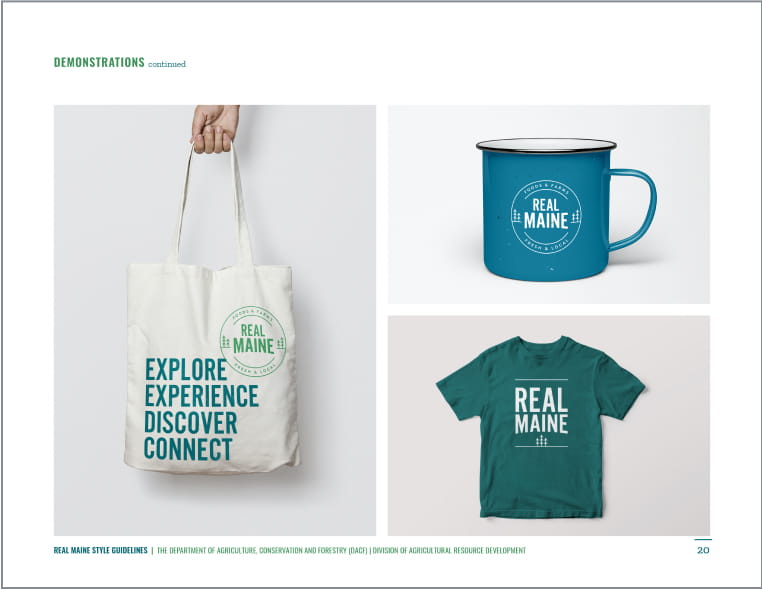
To support the launch we designed a variety of collateral pieces to display the impact and flexibility of the brand, from advertisements to social media to label stickers to merchandise.
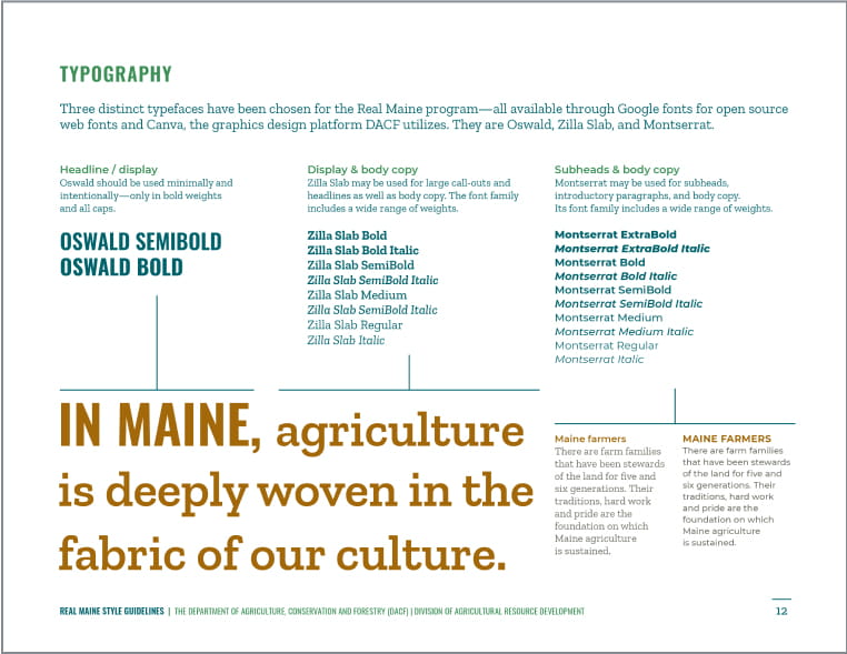
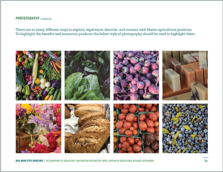
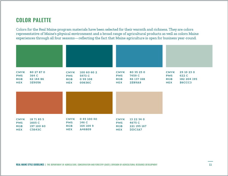
“Working with Owl’s Head Solutions for the Maine Department of Agriculture, Conservation and Forestry’s Division of Agricultural Resource Development’s brand refresh has been a rewarding experience. They were able to take the strategic plan we developed and build a compelling and thoughtful visual component that can be delivered in a variety of ways to the client’s target audiences. Their responsiveness, attention to detail and ability to listen to the client’s needs has resulted in a campaign we can all be proud of.”
—Charlene Williams, President, Marshall Communications
Impact
While it was a unique challenge to provide a brand that worked for such a varied set of stakeholders, the new Real Maine has rolled out to great acclaim. Farmers and producers—and even retailers from local food co-ops to Walmart—have expressed a resounding “thank you” for providing them a refreshed look and feel they can be proud of when marketing their goods.

